I recently talked about being hesitant to make a website for myself, but the thing that tipped me over was the concept of building in public. It’s a riff on a trend that a lot of writers do. Robin Sloan calls it “working with the garage door up.” You do your work openly, showing the entire messy process from conception to completion. Anyone can walk into your garage at any point to see what you’re putting together. The point is letting people see how utterly atrocious your work is before it’s pretty and complete. Sorry, I may be projecting a bit.
Building in public blew up during the pandemic when everyone was stuck at home building side projects and innovating new ways to track COVID stats from their bedrooms. Jokes aside, it started about a decade before that and gained traction when there was a lot of money going into SaaS and B2B startups. The founders of these startups started micro-blogging their lives to Twitter, and this meant showing off the work they were doing. But growing right along side this trend was another one called digital gardening. Where hashtag buildinpublic is curated— you cherry pick the pretty screenshots and challenges-turned-into-life-lessons— digital gardening is raw, half-finished, and sometimes embarrassing. This version of sharing my work seemed much more interesting, and a lot less work.
So what is digital gardening?
I had heard the term before, along with all the adjacent vocabulary— second brains, evergreen notes, Zettelkasten. When I first learned about it year ago, it sounded like something I’d do locally as private notes for my own reference. But my recent interest in it lead me to realize that digital gardens are meant to be public. They’re the garage door, wide open, with all your unfinished projects on display. And before I knew it, I had set out to build this website, called it “Huy’s Digital Garden” before even seeing what kind of technical knowledge goes into implementing one.
I draft this blog post as part of the research in what a digital garden really is. If you’re reading this, it means I did it.
What is a Digital Garden?
A digital garden is a collection of ideas organized by contextual relationships and associative links. If you've ever kept or read a blog, you’d know posts are sorted by date, newest posts first, while older posts sink to the bottom. Digital gardens on the other hand don’t have a strict structure to how posts are organized, as long as they link together through context or shared concepts. You enter the garden through one idea and wander into another, following threads instead of a timeline. The trick behind this are bi-directional links— when note A links to note B, note B automatically links back. Your writing turns into a web instead of a feed.
Another distinction from blogs is that notes in a garden can be unfinished. Blogs pressure the writer to publish complete thoughts, you do the messy work privately, then present the final draft. Digital gardens align more with working with the garage door up. A note in the garden may start as two sentences and slowly grow into a full research paper, all while staying published so everyone can see the messy process.
This means you have to be honest about what's done and what isn't. Good gardeners signal this somehow, either by a status tag or a confidence rating. The point is transparency: don't pretend your shower thoughts are peer-reviewed research.
There's a freedom to it that I like. You're not stuck writing essays. Incoherent brain dumps, code snippets, questions without answers— it all goes in the garden. And because you own the space, you can make it weird. Write a manifesto about your personal beliefs, literally create a timeline of your entire life, or just write about what you’re currently into. So many online spaces squash you into a 200 character bio and profile picture, a garden lets you be messier than that.
One more thing: you should own your garden. Don't build it on Notion or Medium or whatever platform is popular this year. If you're going to tend something for years, make sure it can't disappear when some startup runs out of funding.
Most of this information comes from Maggie Appleton's writing on the history of digital gardens, and from go through a bunch of other people’s gardens. All of this was enough for me to start implementing my own.
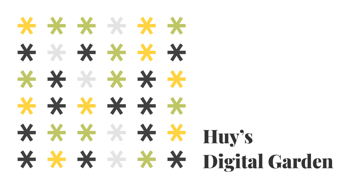
Huy’s Digital Garden
Now that you have a gist of what a digital garden is, I invite you explore mine. It’s a little rough around the edges, and the content is quite sparse. I do have to warn you that this is a much better experience on desktop than mobile.
Exploring Other Digital Gardens
Below I write about a handful of digital gardens that I found when researching the topic. I encourage you to click on links and explore them as well. My writing does not do any of their beautiful websites justice, and they deserve the traffic and clicks. Just remember to come back and continue reading. If you’re on mobile, you have to hop on a desktop. These digital gardens are packed with content that is best enjoyed on a larger screen.
I looked at 20 or so gardens and only chose to write about these four. I write not to critique them, but to compare and contrast what they do as a garden. Keep in mind that each one is customized for hyper-contextualization. One may read like a research paper because the author is a literal applied researcher while another may look like a blog because they’re a creative writer with published works. One is not better than the other, just custom built for their individual needs and wants.
Buster Benson

Buster Benson’s site has some of the most distinctive personal website features I’ve seen in a while. His Codex Vitae is manifesto of how he lives his life, all in a markdown file on GitHub. His Life in Weeks page is a visualization of his entire life from birth to age 100 as a timeline. These are the kind of living documents that feels right at home in the digital garden ethos.
However, any traces of a garden seems to end there. The closest thing to a traditional digital garden on his site is The Piles— a collection of writing categorized by subject. The posts don’t have bi-directional links connecting ideas across categories, and the content itself mostly lives on external platforms like Substack, 750words, and Medium, with his site acting more as an aggregator than a digital garden. It’s well organized, but it’s not networked in the way a digital garden would be.
That said, I love the concept of piles. They give older writing a way to stay discoverable rather than disappearing into a reverse-chronological feed. I've borrowed this idea loosely with a tag cloud and a search command palette to help surface older notes. It's not as visually distinct as Buster's piles, but it solves the same problem: making sure things stay findable.
Maggie Appleton
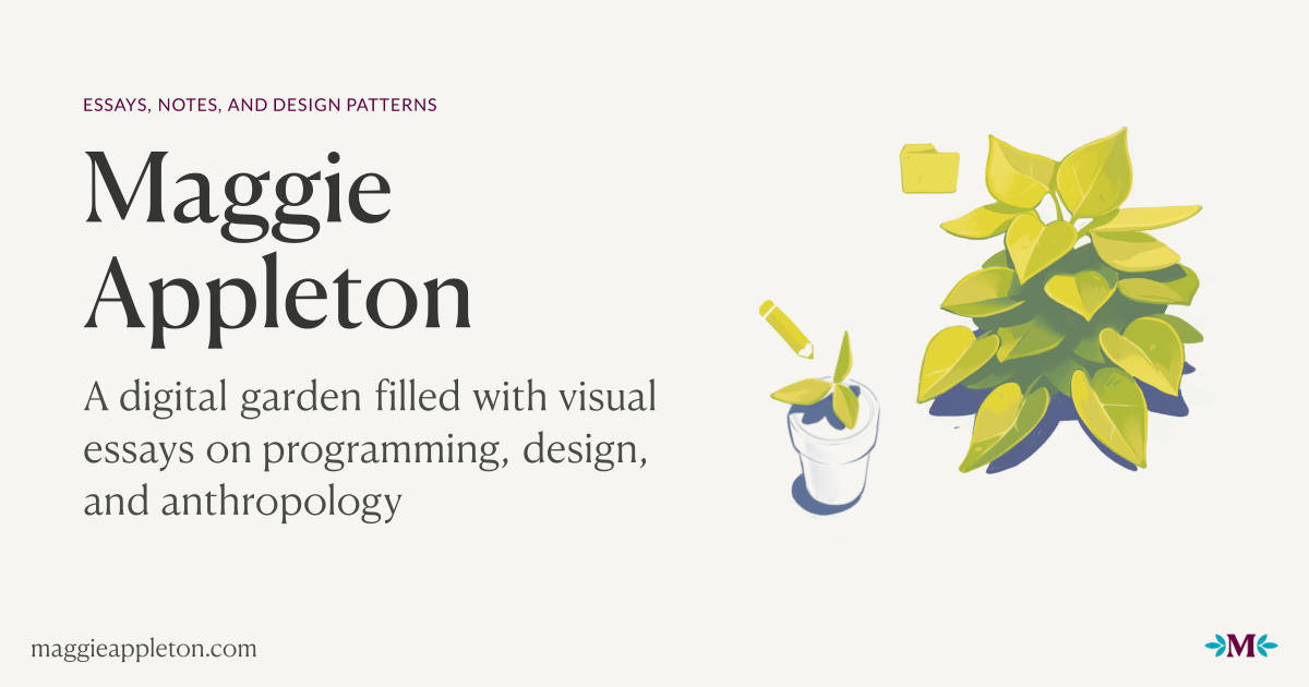

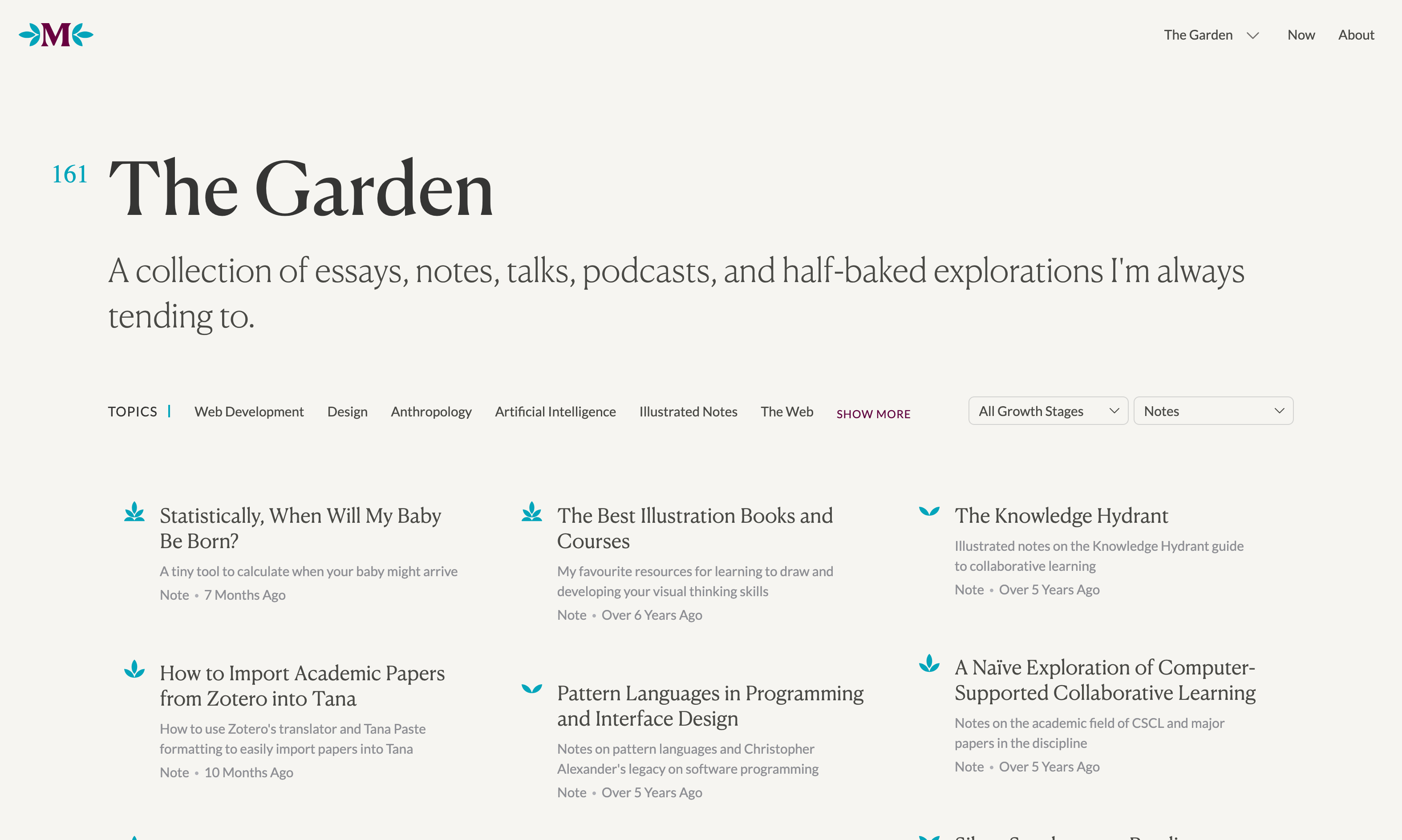
Maggie Appleton's garden is the most visually striking of the bunch. Where Gwern leans into dense text and Andy into functional panels (I talk about these two later), Maggie's site feels like a design portfolio that happens to contain notes. Custom illustrations accompany many pieces, and the overall aesthetic is warm and inviting rather than utilitarian like most of the other gardens I visited.
The garden is organized by both content type and growth stage. Content types include essays, notes, patterns, talks, podcasts, and "smidgeons" (small, fleeting observations). Growth stages range from seedling to budding to evergreen— indicated by small icons next to each piece. Seedlings are rough ideas she's just thrown up. Budding means she's cleaned it up but it's still developing. Evergreen marks work that's reasonably complete, though she still tends to it over time. Each post also shows when it was planted and last tended, giving readers a sense of how long an idea has been growing.
Andy Matuschak
Andy Matuschaks’s separates his website from his working notes (which is his actual digital garden). His unique panel-based design breaks away from the grid layouts we’re used to seeing on many modern websites. Each note is a 486px wide panel with bi-directional links. Click a link and it opens a new panel to the right, keeping every previous note visible to the left. This not only lets you see how one idea can lead to another, but it also shows the trail of thought that got you to where you are.
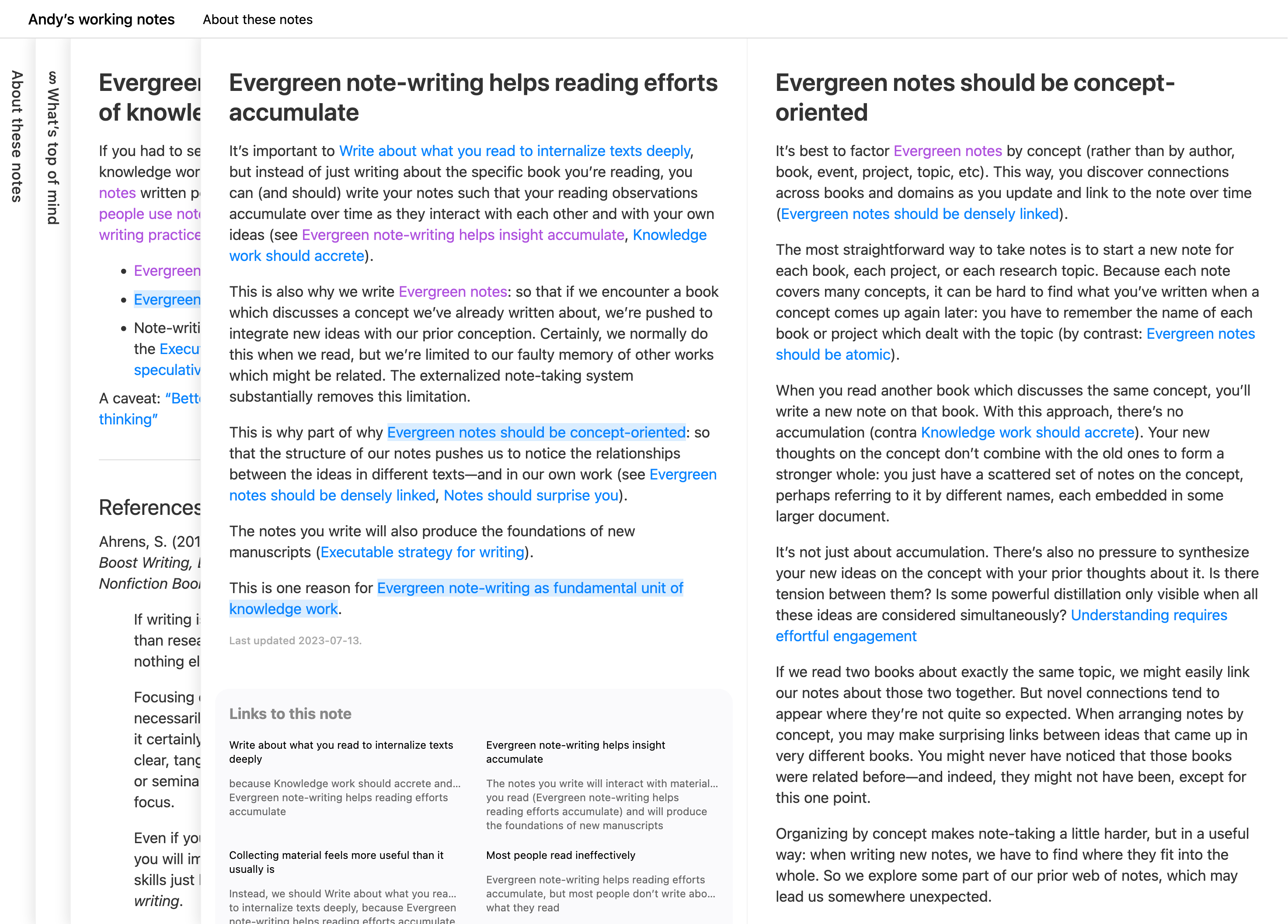
The UI does something I haven’t seen elsewhere: it makes the process of exploring ideas visible. You can literally see the path you’ve taken through his thinking, and the connections between topics become spacial rather than abstract.
This unique UX is not without problems. Horizontal scrolling is clunky unless you have a dedicated button on your mouse or keyboard for it, and the scroll bar at the bottom is slim enough to miss entirely. But these feel like acceptable tradeoffs for what the design accomplishes.
This is the site I keep coming back to for inspiration, and browsing other digital gardens, I’m noticing I’m not alone. Andy’s influence shows up everywhere.
This is the site I kept coming back to, and it's where I stole the most from. Browsing other digital gardens, I’m noticing I’m not alone. Andy’s influence shows up everywhere. My garden uses the same panel system— notes open to the right, previous notes stay visible, tabs collapse when you run out of room. The bi-directional links, the backlinks at the bottom— all taken from Andy. The one thing I've added is a timeline navigation bar at the top to make horizontal scrolling less painful. It lets you jump between notes without dragging a scrollbar or hoping your mouse has a horizontal scroll wheel.
Gwern Branwen
Gwern Branwen’s site is another digital garden just oozing with personality. It’s heavily text based and feels like a classic HTML & CSS static website, until you start hovering over and clicking links.
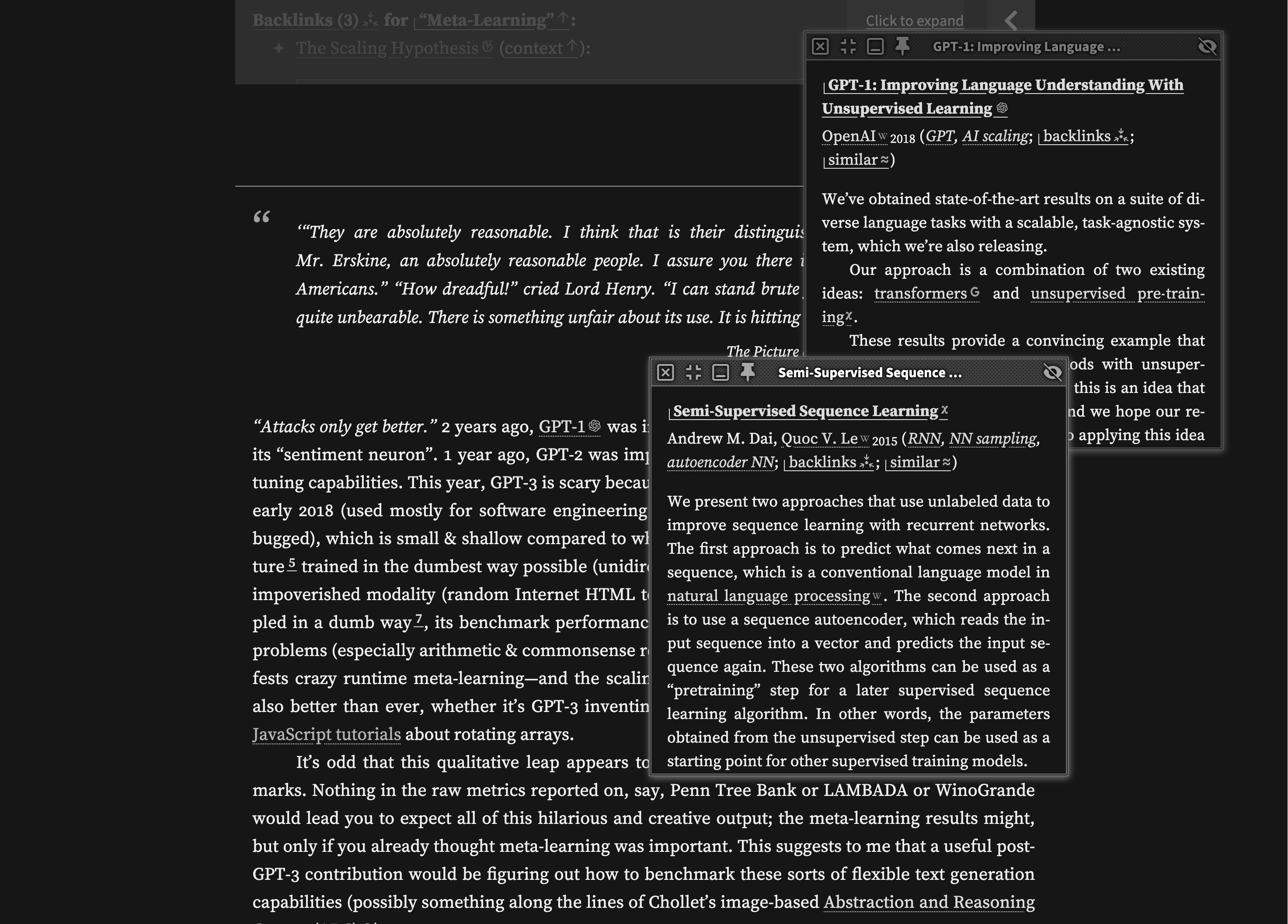
The standout feature is the popup system. Hover over a link and you get a preview. Clicking on them opens a floating window, making the website feel like an operating system running in your browser. These windows can contain articles that have their own links, which spawn their own popups. The effect that you get is that you can explore tangentially without ever losing your place.
On wide enough screens, footnotes turn into side-notes that sit in the margins, letting you read annotations without breaking flow. These side-notes can also expand into their own windows for further reading. Long side-notes collapse automatically to avoid overwhelming the layout.
Something I find charming are the link icons— a small glyph accompanies every link that tells you what you're about to click. Wikipedia links get the Wikipedia logo. Videos get a video icon. Internal links show Gwern's logo. Once you learn the visual language, scanning becomes faster. You know what you're getting into before you commit.
Instead of notes, Gwern calls their writing essays— and rightfully so. Each one is like those six-hour iceberg videos on YouTube: a short summary visible on the surface, with layers of explanation, popups, and annotations hiding just below.
I think if you visit the website yourself, you agree with this statement: the learning curve is real. First-time visitors might find the popups overwhelming or miss features entirely. And the recursive popups, while powerful, can feel disorienting if you lose track of how deep you've gone. Heck, even the monochromatic aesthetic is a little intimidating. But for the kind of research-heavy, reference-dense writing Gwern does, these features make sense. The site is built for readers who want to follow threads without opening thirty tabs. It's opinionated, dense, and unapologetically designed for power users.
Despite being living documents that Gwern revisits and expands over time, these essays read as polished and complete— like research papers that took months to write. The structure is interesting: each essay contains multiple headings that function almost independently of each other. Unlike Andy's atomic notes, where each topic gets its own standalone note, Gwern groups related topics under one essay as separate sections. Some of these sections even have their own backlinks, with bi-directional links pointing to specific headings in other essays rather than just the essay itself.
MVP Achieved
I’ve accomplished what I set out to do. A whole year’s worth of work and I’m proud to say I have a minimum viable product for my digital garden. I’ll be spending the next few months doing a lot of behind the scene stuff for the website, but the foundation has been set.
I write this in hopes to inspire a few of my friends to create their own digital gardens, assuming they read this whole post. No pressure guys, thanks for reading.